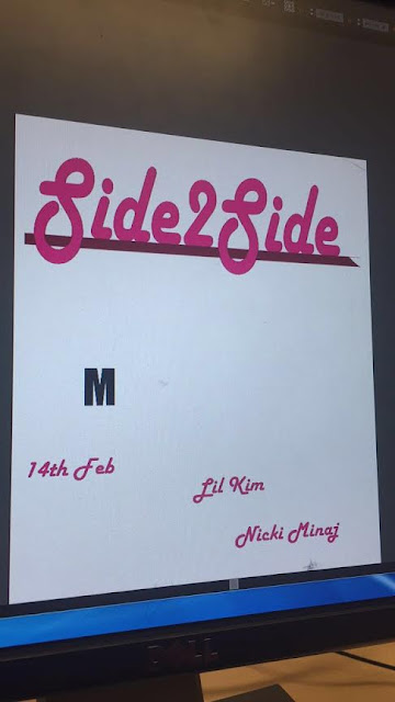
In today's lesson I continued on working on my actual CD cover. I decided to work on the back cover as I felt like it was easier to edit without the photography. For this, Illustrator was used to make the fonts I would use on the back cover:
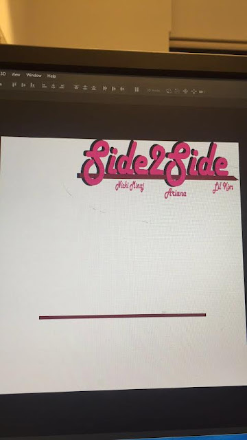
I pulled them to the Photoshop window, and shaped them into how I wanted it to look. I also duplicated the 'Side2Side' logo in black and placed it behind the pink one to create a shadow effect. By the end of the lesson, this is what I had come up with:
Subscribe to:
Post Comments (Atom)
Question 4
https://misskeishaasamoah.wixsite.com/question4
-
The use of intertextuality in this poster is the main thing that I like, and this advert has inspired the look of my advert the most. The fi...
-
I downloaded the Photoshop Trial on my computer to allow myself more time to complete my print products, as it takes quite a while to create...
-
As it was a rough draft a lot of things were not synced or edited properly. A lot of the lip-synching was off as we had just moved a lot ...
No comments:
Post a Comment